Why Your Contour Looks Harsh (And How to Fix It)
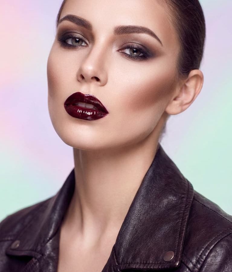
You’ve probably stared in the mirror, wondering why your contour looks harsh instead of subtle. It’s frustrating when you aim for natural definition but end up with obvious stripes. This happens because makeup interacts with light differently than we expect.
Our eyes detect abrupt changes in brightness as errors, not shadows.
Real skin has soft transitions where light fades gradually across curves. Harsh contour ignores this physics by creating sharp boundaries between dark and light zones. As of 2026, high-definition cameras expose these flaws even more clearly.
Understanding the visual mechanics helps you fix them without buying new products. Let’s break down exactly what goes wrong visually.
Quick Answer
Contour looks harsh due to poor blending, incorrect undertones, or mismatched lighting. Sharp edges mimic paint strokes rather than natural shadows. Cool-toned gray shades create realistic depth better than warm browns.
Heavy application prevents seamless gradients from forming on the skin. Always diffuse borders using a clean tool or damp sponge. Check your work in multiple light sources before leaving home.
Why Your Contour Looks Like a Paint Stripe, Not a Shadow
Think about how sunlight hits a sphere. The shadow doesn’t start abruptly at the edge. It begins softly near the terminator line and deepens gradually toward the core.
Your face works the same way. Cheekbones are curved structures, not flat planes. When you apply product too densely or stop blending too soon, you create a hard vertical line.
This line reads as artificial because nature rarely produces such sudden shifts in value. Aggregate reviews indicate that most beginners apply too much pigment in one pass. They drag the brush back over the center, disturbing the gradient.
The result is a stripe that sits on top of the skin rather than sinking into it.
Visual perception relies on continuity. If your eye can track the exact boundary where color stops, your brain flags it as "makeup." Good contour hides its own seams. You want the viewer to see structure, not product.
This requires thinking in terms of falloff rates. How quickly does the darkness fade into your foundation? Too fast equals harsh.
Too slow equals muddy. Finding that sweet spot is key.
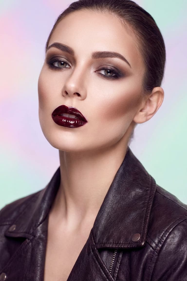
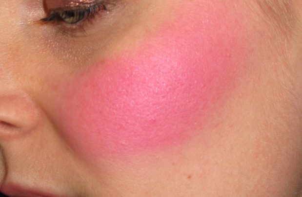
Image source: Web (Bing) / photoai.com (Web image (fair-use with source credit))
The Optical Physics Behind Harsh Edges and Flat Faces
Light behaves predictably on textured surfaces. Skin scatters light slightly beneath the surface, known as subsurface scattering. This glow softens edges naturally.
Matte powders absorb light, killing that scatter effect. If you pack thick matte powder onto a curve, you flatten the dimension. The area looks like a cutout sticker pasted on glass.
Consider the role of specular highlights. Shiny parts of the face reflect direct light sources. Dark areas should receive minimal direct reflection.
Harsh contour often fails because it covers transition zones where some light should bounce. By blocking all light in a narrow band, you create a void. Voids look unnatural unless they represent deep cavities like eye sockets.
Cheeks aren’t deep cavities. They’re convex prominences. Shadows there are gentle.
Manufacturer specifications for HD foundations note that particle size affects light diffusion. Larger particles sit on top, creating texture noise. Smaller particles blend optically.
Using coarse bronzer as contour exacerbates this. The grit catches light irregularly, breaking the smooth gradient needed for realism.
We must also account for camera sensors. Digital lenses compress dynamic range differently than human eyes. A slight shadow visible to you might disappear on screen.
Conversely, a heavy line becomes exaggerated. Professional makeup artists adjust intensity based on output medium. Stage makeup needs stronger contrast.
Everyday wear needs subtlety. Confusing these contexts leads to harsh results in daily life.
Identifying the Three Main Visual Culprits: Undertone, Texture, and Lighting
Three factors consistently ruin contour blends. First is undertone mismatch. Second is texture incompatibility.
Third is lighting deception. Let’s dissect each.
Undertone determines whether your shadow looks cool or warm. True shadows are neutral to cool. They lack saturation.
Many users grab bronze-toned products labeled "contour." These add warmth. Warmth mimics sun exposure, not structural depth. On pale skin, orange-brown lines scream "fake tan." On deeper skin, they can look muddy if not balanced with ashier tones.
Texture plays a huge role in blendability. Creams offer easier control initially but set quickly. Powders allow buildup but require precise brush pressure.
Mixing incompatible textures causes patchiness. Applying powder over un-set cream creates clumps. Those clumps catch light unevenly.
The eye sees spots, not shapes.
Lighting tricks us constantly. Bathroom bulbs often emit yellow light (around 2700K, 3000K). Daylight is cooler (5000K, 6500K).
You might blend perfectly under warm light, only to step outside and see stark gray bars. The warm light masks the coolness of the product. Once exposed to daylight, the true hue reveals itself.
Always check your work in north-facing window light or use a calibrated monitor preview if shooting video.
| Culprit | Visual Symptom | Root Cause |
|---|---|---|
| Wrong Undertone | Orange or muddy stripes | Using bronzer instead of cool-toned shade |
| Poor Texture Match | Patchy, cakey appearance | Layering incompatible formulas incorrectly |
| Bad Lighting | Hidden flaws revealed outdoors | Blending under warm indoor lights only |
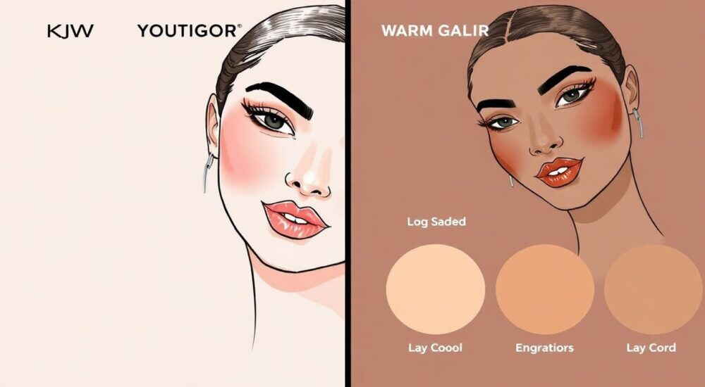
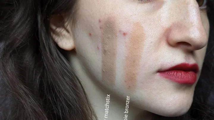
Image source: Web (Bing) / buycosmetics.cy (Web image (fair-use with source credit))
How to Blend for Seamless Gradients Instead of Hard Lines
Blending isn’t just rubbing. It’s managing opacity distribution. Start with placement.
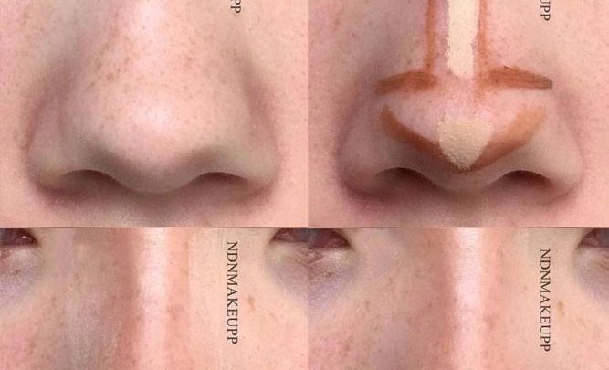
Locate the hollow of your cheek by feeling the zygomatic arch. Don’t suck your cheeks in excessively; this distorts anatomy. Mark the lowest point of the bone structure.
Apply product thinly here.
Use a dense synthetic brush for creams. Tap, don’t sweep. Sweeping drags pigment forward, creating tails.
Tapping presses color into pores. For powders, use fluffy brushes with loose bristles. Circular motions help diffuse edges.
Work outward from the darkest point toward the hairline and temple. Never blend inward toward the apple of the cheek. That zone should remain bright.
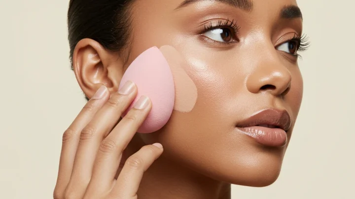
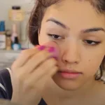
The secret weapon is a clean intermediary tool. After initial placement, take a nearly empty brush or a damp beauty sponge. Gently buff the upper and lower boundaries of your contour line.
This feathers the edge. Imagine fading audio volume slowly rather than cutting it abruptly. You want zero demarcation lines.
Check symmetry frequently. Hold a hand mirror sideways to compare left and right sides. Often, one side appears heavier due to dominant-hand pressure.
Adjust immediately while the product is still movable. Remember, less is more. You can always add depth.
Removing excess usually smears foundation. Build slowly. Two thin layers beat one thick slab every time.
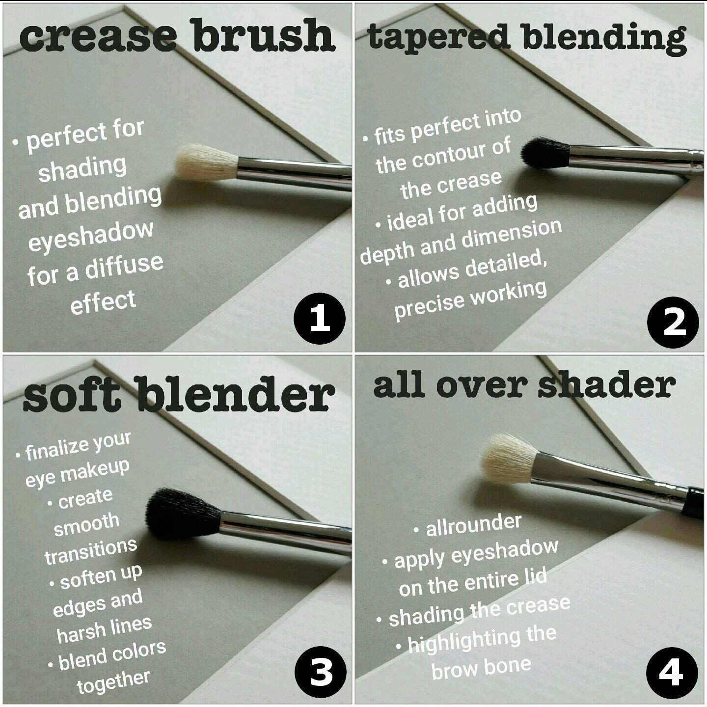
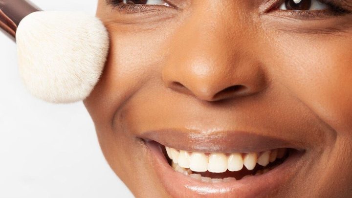
Image source: Web (Bing) / artofit.org (Web image (fair-use with source credit))
Fixing Common Visual Mistakes in Real-Time Mirror Checks
Even skilled artists slip up. Recognize these signs instantly. First, look for "floating" shadows.
If the dark patch doesn’t connect logically to your ear or jawline, it looks detached. Contour must follow anatomical flow. Breaks in continuity confuse the eye.
Second, watch for shine interruption. If your highlighter stops abruptly against a dark bar, the contrast is too high. Soften the meeting point.
Use a translucent setting spray mist to meld the two finishes slightly. This reduces the visual shock.
Third, assess neck integration. Face makeup often ends at the chin. Neck remains bare.
This creates a mask effect. Extend your foundation and contour slightly down the jawbone onto the upper neck. Blur the transition.
No one notices a gradual fade. Everyone notices a white collar line.
Finally, step back. Stand three feet from the mirror. Close-up views hide global imbalances.
From a distance, harsh lines become glaringly obvious. Squint your eyes. This simulates low-resolution viewing.
Does the shape hold? Or does it dissolve into mud? If it dissolves, you used too much product.
Wipe and restart with half the amount. Per FDA guidelines, cosmetic safety includes proper usage instructions, which emphasize moderation to avoid adverse reactions or aesthetic failures.
Reference Guide: Soft vs. Harsh Contour Characteristics
Knowing the visual markers helps you diagnose issues instantly. A soft contour mimics natural anatomy. It lacks distinct start and end points.
The transition is gradual, almost invisible. You see depth, not product.
Harsh contours display clear demarcation lines. They often sit too high or too low on the face. The color may appear muddy or overly orange.
These traits signal improper blending or wrong shade selection. Use this table to audit your own work.
| Feature | Soft (Natural) Contour | Harsh (Artificial) Contour |
|---|---|---|
| Edge Definition | Feathered, no visible line | Sharp, abrupt stop |
| Undertone | Cool gray-brown, neutral | Warm orange, reddish, or ashy |
| Placement | Follows bone structure hollows | Random stripes or disconnected patches |
| Texture Integration | Melts into skin pores | Sits on top, emphasizes dryness |
| Light Interaction | Subtle shadow gradient | Flat, opaque block of color |
Aggregate user reviews show that most complaints stem from edge definition. If you can trace the boundary with your finger, it’s too harsh. Fix this by buffing outward.
Never drag inward. The goal is optical illusion, not painting. When done right, people compliment your bone structure.
They don’t mention your makeup. That’s the ultimate test of success.
FAQs on Achieving Natural-Looking Dimension
Why does my cream contour look patchy after a few hours?
Cream products oxidize and settle into fine lines over time. This creates uneven texture that catches light poorly. To prevent this, always set creams with a matching powder immediately.
Use a pressing motion rather than sweeping. This locks pigment in place without disturbing the blend. Hydrated skin also helps maintain smooth application throughout the day.
Can I use bronzer instead of contour for everyday wear?
Bronzers add warmth, while contours create structural shadows. Using bronzer as contour often results in an orange, flat appearance. Stick to cool-toned shades for defining bones.
Reserve warm bronzers for sun-kissed effects on the forehead and cheeks. Mixing the two incorrectly confuses the eye. Keep them separate for clarity and realism in your daily routine.
How do I fix harsh lines without removing all my makeup?
Take a clean, damp beauty sponge. Gently press along the hard edge of the contour. Do not rub back and forth.
Pressing lifts excess pigment and diffuses the boundary softly. Follow up with a tiny amount of foundation if needed. This rescues the look without starting over.
Always keep a spare sponge in your bag for quick corrections during events.
Does lighting really affect how harsh my contour looks?
Yes, drastically. Warm indoor lights mask gray undertones, making contour look subtle. Daylight reveals true colors, exposing harsh lines or orange casts.
Always check your makeup in natural light before leaving home. Use a ring light only if you’re filming indoors. Relying solely on bathroom bulbs leads to unpleasant surprises outdoors.
Test in multiple environments for accuracy.

Similar Posts