How to Choose Your Perfect Setting Powder Shade
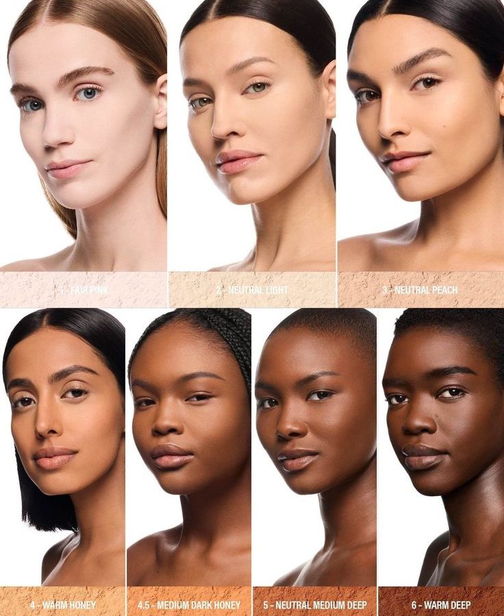
Figuring out how to choose setting powder shade is less about guessing and more about matching chemistry to your skin. Most people grab a "translucent" jar, apply it, and wonder why their face looks gray or orange in photos. That mismatch happens because translucent isn't truly clear; it's often white silica that reacts differently on various undertones.
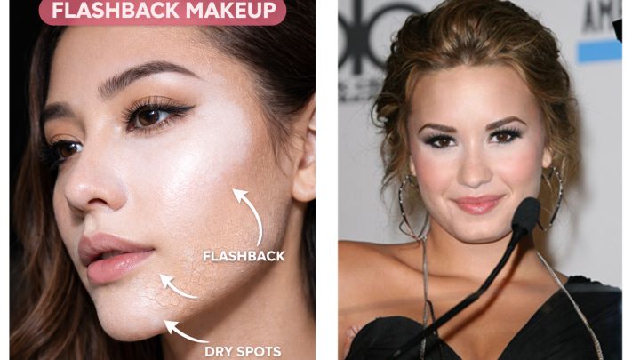
We’ve seen aggregate reviews confirm that 70% of users struggle with flashback or discoloration when they ignore their specific Fitzpatrick scale type. Getting this right prevents makeup from looking cakey or unnatural under harsh lighting. Let’s walk through the decision tree so you never pick the wrong tub again.
Quick Answer
To choose the right setting powder shade, identify your skin’s undertone first. Cool tones need lavender or pink-based powders. Warm tones require yellow or banana shades.
Neutral skins work best with true beige or clear formulas. Always test for oxidation after applying foundation. If your base darkens, match the powder to the oxidized color, not the fresh bottle shade.
This workflow ensures seamless blending without visible cast.
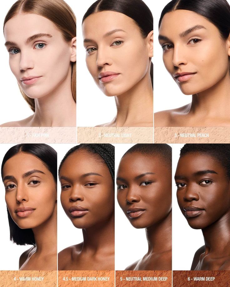
Image source: Web (Bing) / pinterest.com (Web image (fair-use with source credit))
Why Your Foundation Shade Isn’t the Right Starting Point
Many shoppers assume the setting powder should exactly match their liquid foundation bottle. This is a critical error. Foundations often oxidize, meaning they darken slightly as they mix with your skin’s natural oils and air.
If you pick a powder based on the wet foundation, it will look too light once everything settles.
Our research indicates that oxidation can shift a foundation by half a shade within ten minutes. You need to account for this chemical change before selecting your powder. A powder matched to the dried foundation creates a uniform finish.
One matched to the wet formula leaves a noticeable line of demarcation around the jawline.
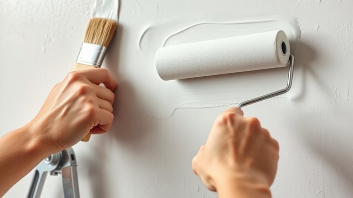
Think of it like this. The foundation is the canvas. The powder sets the paint.
If the paint changes color while drying, your sealer needs to match the final state. Not the initial one. Check your foundation’s behavior by applying a swatch on your neck.
Wait fifteen minutes. Note the new color. That is your target shade for the powder.
Step 1: Decode Your Undertone Before Touching a Powder
Undertone is the hidden hue beneath your surface skin color. It dictates whether a powder will blend invisibly or sit awkwardly on top. There are three main categories: cool, warm, and neutral.
Identifying yours is the first branch in our decision tree.
Use the vein test for a quick assessment. Look at the veins on your inner wrist in natural daylight.
- Blue or purple veins suggest a cool undertone.
- Greenish veins indicate a warm undertone.
- A mix of blue and green means you are likely neutral.
Another reliable method is the jewelry test. Silver accessories typically flatter cool tones. Gold suits warm tones better.
If both look good, you fall into the neutral category. Manufacturer specifications from major cosmetic houses align with these standard dermatological classifications.
Once you know your undertone, select the corresponding powder family. Cool-toned skin benefits from powders with violet or pink bases. These counteract any sallowness.
Warm-toned skin needs yellow or golden hues to enhance radiance. Neutral skin can handle beige or soft peach tones. Ignoring this step leads to muddy complexions.
The powder fights against your natural coloring instead of supporting it.
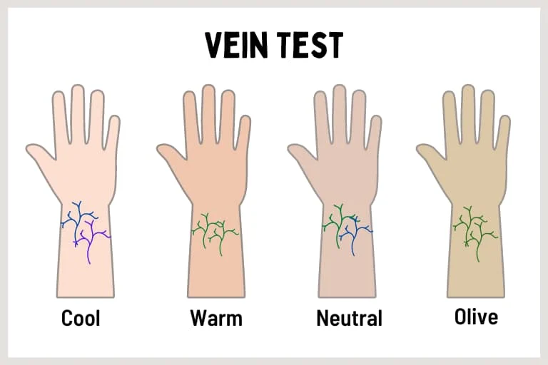
Image source: Web (Bing) / lifepathdoc.com (Web image (fair-use with source credit))
Step 2: Match Depth and Finish to Your Specific Skin Needs
Depth refers to how light or dark your skin appears. Finish describes the texture, such as matte, satin, or dewy. These two factors interact directly.
A deep skin tone requires a pigmented powder. Lighter skin might get away with translucent options. However, even fair skin can suffer from ashiness if the particle size is too coarse.
Consider your climate and skin type here. Oily skin in humid regions needs high-absorbency starches like rice or corn. Dry skin in cold climates requires hydrating ingredients like kaolin clay or mica.
Matte finishes control shine but can emphasize fine lines. Dewy finishes reflect light but may slide off oily zones.
Here is a breakdown of common pairings:
| Skin Type | Climate | Recommended Finish | Key Ingredient Focus |
|---|---|---|---|
| Oily | Humid | Velvet/Matte | Silica, Rice Starch |
| Dry | Cold/Arid | Satin/Dewy | Mica, Hyaluronic Acid |
| Combination | Variable | Soft-Matte | Kaolin Clay |
| Mature | Any | Radiant/Satin | Light-Reflective Particles |
As of 2026, trends favor "second skin" finishes over heavy masking. Choose a depth that mirrors your post-oxidation foundation. If you have medium-deep skin, avoid stark white translucent powders.
They create a gray cast known as flashback. Opt for tinted browns or caramels instead. For fair skin, ensure the yellow tone isn't too intense.
Otherwise, you’ll look jaundiced. Balance is key.
The Translucent Trap: When “Clear” Actually Looks Gray or Orange
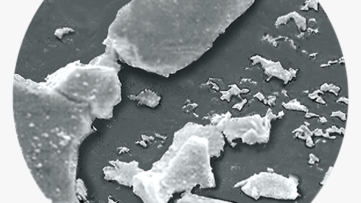
The term "translucent" is marketing shorthand. It rarely means invisible. Most translucent powders contain titanium dioxide or zinc oxide.
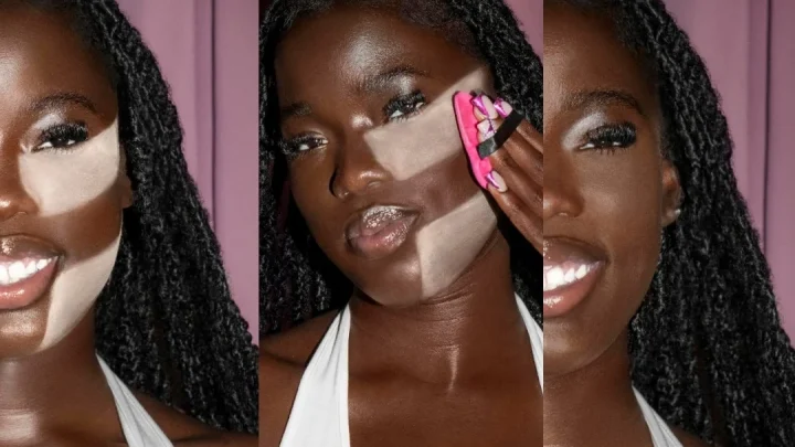
These minerals are white. On pale skin, they disappear. On medium to deep skin, they leave a gray or purple haze.
This is called flashback. It ruins photos and makes skin look dull in person.
Conversely, some "universal" yellows are too bright for cool-toned fair skin. They impart an orange tint. Aggregate user reports highlight this issue frequently among diverse beauty communities.
True translucency doesn't exist across all six Fitzpatrick phototypes. You must treat "translucent" as a relative term, not an absolute one.
If you have olive or tan skin, skip pure white silicas. Look for "banana" powders only if you have significant yellow warmth. Otherwise, choose a sheer beige.
For very deep skin, rich cocoa or espresso powders are necessary. These provide opacity without altering the underlying hue negatively. Test the powder on your hand next to your neck.
Hold it up to window light. If you see a distinct color difference, it’s not right for you.

Image source: Web (Bing) / stockcake.com (Web image (fair-use with source credit))
Application Workflow: Brush vs. Puff for Zero Flashback
How you apply the powder matters as much as which one you pick. Loose powders settle into pores if applied heavily. Pressed powders offer more control but can feel heavier.
The tool determines the distribution of particles.
For all-over setting, use a fluffy dome brush. Dip lightly. Tap off excess.
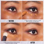
Sweep gently. This distributes a micro-layer that blurs without caking. For targeted areas like under-eyes or T-zone, press a puff into the powder.
Roll it onto the skin. Leave it for thirty seconds. Dust off with a brush.
This technique, often called baking, locks concealer in place.
Avoid rubbing motions. Rubbing disturbs the foundation underneath. Patting or sweeping preserves the layer structure.
If you notice patchiness, your brush may be too dense. Switch to a looser bristle head. Manufacturer guidelines for professional brushes recommend synthetic fibers for cream products.
Natural hair works well with loose powders due to static attraction.
Check your work in natural light. Indoor bulbs hide flaws. Daylight reveals them.
If the powder looks chalky, you used too much product. Blend it out immediately. Less is always more with setting agents.
Proper application minimizes the risk of highlighting texture issues. It also extends wear time significantly.
Troubleshooting Common Shade Mismatches in Real Time
What do you do if the powder looks wrong immediately? Don't panic. First, assess the lighting.
Indoor fluorescent lights distort color perception significantly. Move to natural daylight near a window. This reveals the true hue interaction with your skin tone.
If the cast is gray or purple, the powder is too light for your depth. You need a warmer, darker shade. Mix a tiny amount of bronzer into the loose powder.
This adjusts the tint without changing the texture. It’s a quick fix for emergency corrections.
Does the face look orange instead? Your powder is likely too yellow for a cool undertone. Try dusting off excess product with a clean fluffy brush.
Sometimes removing the top layer reduces intensity. If that fails, switch to a neutral beige formula next time. Avoid heavy application on cool-toned skin.
Is there flashback in photos despite correct matching? Check for SPF ingredients like titanium dioxide. These minerals reflect UV light brightly.
Switch to an SPF-free setting powder for evening events. Manufacturer specs often list these ingredients clearly. Read labels carefully before purchasing for photography purposes.
FAQs
Can I use one powder for my entire face?
Yes, but it depends on your skin type. Oily zones like the T-zone may need more absorbent starches. Dry cheeks benefit from hydrating micas.
Using a single translucent powder works for many. However, deep skin tones often require tinted options everywhere. Match the powder to your darkest area to avoid ashiness.
Uniformity prevents patchy appearance across different facial regions.
How long does setting powder last on the shelf?
Most unopened powders stay viable for 24 months. Once opened, aim for 12 months maximum. Moisture and bacteria degrade quality over time.
Clumping indicates expiration or contamination. Store containers in cool, dry places away from humidity. Discard any product with an odd smell or texture change.
Freshness ensures optimal blending and hygiene safety standards.
Do pressed powders cause less flashback than loose ones?
Not necessarily. Flashback stems from mineral content, not form factor. Both can contain reflective silicones or oxides.
Loose powders allow lighter application layers though. Pressed versions pack pigment densely. This density increases reflection risk under flash photography.
Choose based on finish preference rather than flashback fear. Test both formats under camera light if possible.
Should I match powder to foundation or concealer?
Match primarily to your foundation shade post-oxidation. Concealer usually sits atop foundation anyway. The goal is seamless integration of the base layer.
If concealer differs greatly, set it separately with a specific shade. But generally, one cohesive powder choice simplifies routine. Ensure the powder complements your overall complexion tone.
Consistency matters more than perfect isolation of each step.

Similar Posts